Predicting the future is one of the hardest things to do especially, if you have to predict the future of an industry that evolves every day. Same holds true for web design. One trend that was wildly popular few months back will no longer exist. You will see some shades of retro style from 70’s fifty years later. That’s how unpredictable web design industry is. You are not sure about what will happen next.
To give you a clear perspective on how web design industry will evolve in 2019, here are 17 web design trends that will make their presence felt on the world wide web.
Table of Contents
1. Inclusive Design
Web accessibility is one of the most talked about topics in web design but despite that, very few web designers create web design that are truly accessible which is ironic to say the least. Inclusive Design might seem like a rebranded version of web accessibility, but it is much more than that.
By incorporating inclusive thinking into your design process, you can not only improve the user experience of your website but also achieve your business goals. Although, the cost of going inclusive might be incremental but the return on investment is much higher. By simply accommodating special users, you can also enhance the web experience for normal users.
2. Bold Serif Typography
One of the most common feature of design trend list for last couple of years now, Bold Typography will continue to make an impact on web design. If your website is heavy on website copy then, sans serif might be the go to option but web elements where there is less text, bold serifs will make their presence felt. Whether it is a header or a call to action, you will see bold typography attracting your attention in the future.
Although, we usually don’t associate serifs with modernism, but serifs are designed to be decorative and when you add boldness to serifs it can prove to be a ideal tool for emphasis and drawing user attention to a particular website element. We might see different variations of serifs grace our screens such as rounded serif or wedge serif
3. Three Dimensional Illustrations
If you have been following the web design trends, you might be forced to believe that future of web design will be flat. Suddenly, out of nowhere some brands start endorsing and embracing 3D illustration, which forces you to change your mind. With cut out illustration style made famous by Slack, web designers will focus on adding more realism and depth to their designs, blurring the boundaries between physical and digital world in the process.
This will bring human beings closer to physical products and let web users develop a better understanding of digital elements. Some web designers will take things up a notch by letting users tinker with digital elements such as graphs and icons. We will start to see many brands jump on the 3D illustration bandwagon in 2019. To ensure your 3D illustrations is rendered smoothly, invest in cheap dedicated server from HostNoc to deliver unparalleled user experience.
4. CSS Grids
Previously web designers and developers find it difficult to properly centrally align elements both horizontally and vertically. Flexbos has resolved this issue to a certain extent. Now, web designers can easily implement complex web layouts without breaking a sweat. This has helped them to create the much-touted Holy Grail layout. The problem with Flexbox is that it doesn’t let designers change vertical and horizontal positioning of elements at the same time. That is where CSS Grid comes into play.
With CSS grid, you can place web elements exactly at a point you want, whether it is horizontally or vertically. It gives web designers the level of freedom and control that print used to offer. Despite all this, Chrome Platform Status data shows that 83% page views still include Flexbox and only 1.5% are using CSS Grid. Web designers need to change course and embrace CSS grid before it is too late.
5. Mobile First Animation
Recently, we saw the introduction of scroll based animation. Businesses have also started using a timed animation to keep the user glued to their page. Although, these tactics works best on desktop but not on mobile. For create the same effect on tiny screens, web designers will create mobile first animations. For that, they will have to take the mobile first approach when designing interaction. It will be interesting to see how web designers bring desktop web design to mobile devices.
6. Font That Cover Entire Screen
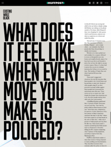
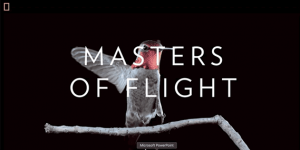
Designers and copywriters have always been at a crossroads about what come first in design process, content or design. Copywriters will argue content deserve its place at the top because web publishing is also publishing. Designers will start to take keen interest in letterforms and we will see more websites that put content above everything else. Some brands will let text do the talking on their homepage. Rolling Flowers is the best example in this regard. Even Huffington Post is jumping on the large font bandwagon.
7. Interactive Cursor Design and Animation
Cursor is the primary tool for human computer interaction. It impacts user interaction with digital content more than anything else. That is the reason why many web designers are reluctant to try new things with the cursor. Thankfully, there are some designers who have taken this bold step.
They have managed to create exceptional playful cursor designs and animations. Web designers will try different things with the cursor making the point about how much more you can do with a cursor other than clicking, pointing and scrolling. You will see website that will trigger an animation as soon as you click and hold a cursor.
8. Overlap, Overlap, Overlap
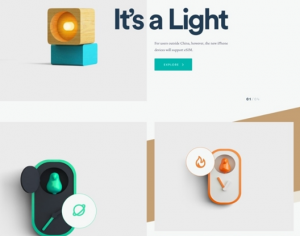
Web design community was a buzz when card design was first introduced. What the card design trend really did was that it made designers focus more on discrete objects that were clearly grouped together. According to the law of uniform connectedness, “Elements that are visually connected are perceived as more connected than elements without any connection.”
In the screenshot above, you can clearly see the lamp on the left-hand side of the text “It is a light”, clearly depicting what uniform connectedness is all about. We see designers explore different avenues to establish connection between different design elements in 2019. It could come from a newsletter, collage of images or from any other sources. One thing is for sure, we will a lot of these things overlap with web design in coming months.
9. Outlined Typefaces
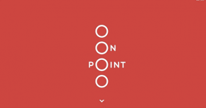
Another web typography trend that will continue to dominate in 2019 is outlined typefaces. Web designers will experiment half normal and half outlined text to immediately grab your attention and keep you engaged for longer. An easy on the eye letterform is a breath of fresh air in a design world dominated by bold sans serif typefaces. Moreover, it will give your design a traditional look that very few boast these days thus, making your design stand out from the crowd too. As a new brand, that is exactly what you want and that is exactly what you will get with outlined typefaces.
10. Playful to Serious Logos
We are seeing a paradigm shift in logo design industry which is moving from playful wordmarks to more serious logos. 2018 was the year when top brands revamped their brand logos from eccentric to sans serif equivalents. Helvetica font became wildly popular across brand logos in 2018. Some of the notable examples are Uber, Marketo and MailChimp. We will shades of this in web design as well in near future.
11. Rise of Brutalism
Although, the term “brutal” might offend many people but this design trend will take off in 2019. If you want to break away from the minimal design that has been popular for quite some time now, want to try something other than homogenous web or sick and tired of the friendliness that most brands try to reflect, then brutalism’s in your face design might be what you are looking for.
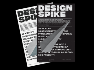
Brutalism will branch out and will not be limited to internal meeting posters and iterative concepts. Squarespace embraced brutalism in its recent rebrand where it highlighted the brash personality of New York City along with its visual aesthetic. It might seem like a weird combo to many, but it worked. Like every other rebellious trend, it might seem a far cry at first but slowly it will go mainstream.
12. Organic Shapes
Traditionally, web designers use a grid system to arrange different elements of the website. That is the main reason why they opt for shapes like rectangle and square which tend to fit easily into the grid setup. In 2019, we will see a shift towards more natural and organic shapes.
Organic shapes are not perfect like geometrical structures and has an asymmetric outlook to them, but they can provide the level of depth in web designs that geometrical shapes cannot. Remember the drawing we used to make when we are in school? The scenery with trees and hills in the background. You will see shades of that in web design this year. It will add a humane touch to your designs and give an illusion of movement.
13. Glitch Art
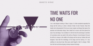
If you have been following such lists that mentions design trends than you might have seen that retro design making a comeback is a regular feature. This list is no different. The only difference here is that glitch art is more like a retro gone wrong than an old trend making a comeback.
With technological breakdowns becoming commonplace, it give designers a new concept which they can turn into designs. Just like brutalism, it might seem a bit weird at first, but it will give your website a psychedelic look that will make your website truly unique. Moreover, it will help you attract users eyeballs and keep it there too.
14. Micro Interaction
How much time do you spend on a website that has a boring design and has nothing to offer? Couple of seconds, right. If you want your users to stay on your website for long, you will have to surprise them with something thay are not expecting. It could be as simple as event that lure users or small actions and responses that facilitates users and enhance the overall user experience of your website.
The message or notification icon you see at the top with a number writing on it when you log into your Facebook account is also a form of micro interaction. 2019 will be the year when we will see more interactive versions of micro interaction make their way to web designs.
15. Interactive Videos
With our hectic daily routines and our dwindling attention spans, we rarely get time to even scan a complete web page, let alone read the whole content on it. That is where a video can come in handy. If you are on the move and want to know about a business and its products, watching a short video that explains everything will come in handy.
Google’s moves to include videos in its search results make the case for video even stronger. Due to this, businesses are now focusing on video production. This means that you will see lot more videos on websites than you have ever done before. Different web designers will use video differently. Some will use it as a background while other will use it as a separate element on their websites.
16. Minimalism
Minimalism is probably the longest running web design trend that continues to impact web design. By opting for a minimalistic design, you are giving your audience less to think of and less clutter to distract them. The end result is that they will focus on website elements you want them to focus on especially, if you use negative space intelligently.
Scroll based animations and fade in effects will make scrolling more fun while resulting in more whitespaces, clear text and more contrast. With less elements to focus on, users will spend more time on your website and don’t get confused.
17. Diversity
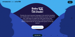
Internet is a global network that connects billions of people, each having their distinct culture, identities, gender, age etc. This distinction will result in a trend of design diversity that will sweep across the web in 2019. The use of socially conscious, culturally diverse imagery and design will become commonplace. Your website visitor wants to connect at a human level and want to see shades of themselves in the copy.
Which web design trend will dominate in 2019? Feel free to share your opinion with us in the comments section below.


